App store screenshot templates
1064 designs, made of 56 layouts crossed with 19 colour themes. Pick one, drop your screenshot in, change the words, export at the size the store wants.
Free, no signup, no watermark. Everything below was drawn by the tool itself, so a template is exactly what the picture shows.
50 layouts for store screenshots
A layout decides where things sit. Every one below is shown in the same theme - Ember - so what changes between tiles is the composition rather than the palette.
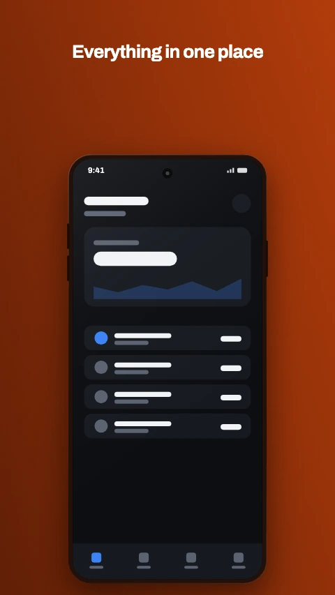
Caption above
Headline at the top, device below. The default for a reason.
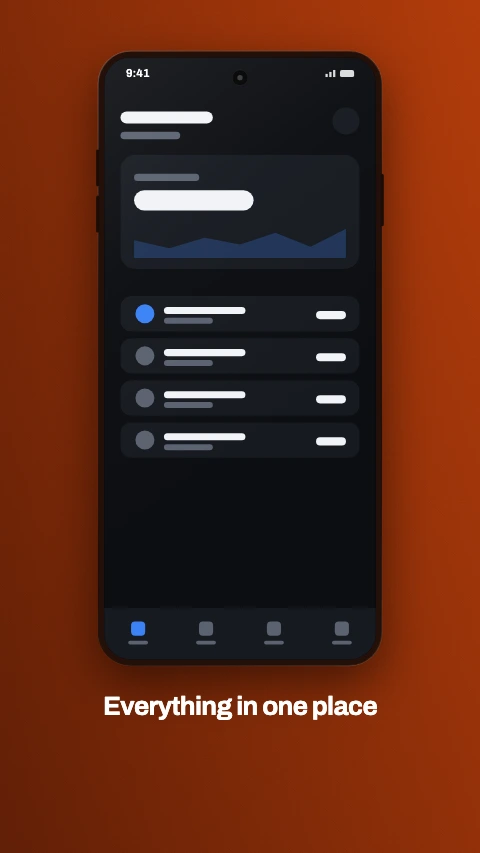
Caption below
Device first, caption underneath - reads as a product shot.
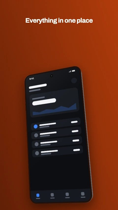
Angled
A tilted phone with the caption running across the top.
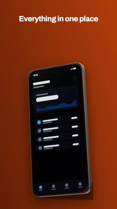
3D hero
One device, real geometry and lighting. For the lead frame.
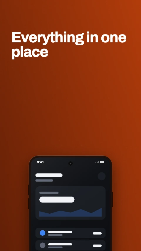
Big type
Type is the whole frame, with the device peeking in at the bottom.
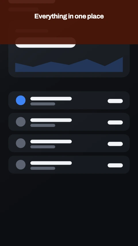
Frameless
The screen fills the frame, chassis cropped away. The 2026 direction.
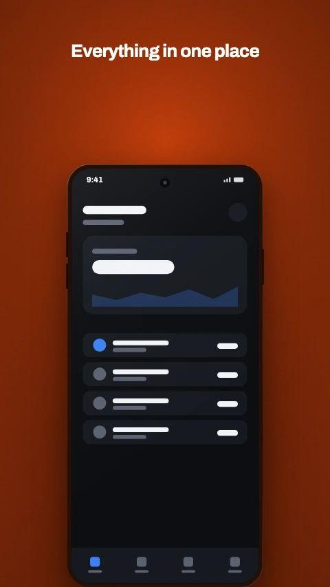
Panoramic
One background flowing across every frame in the set.
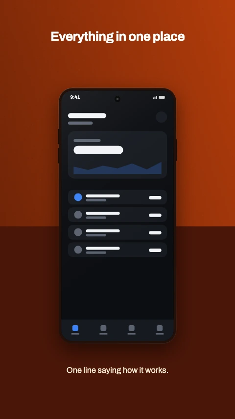
Split panel
A panel across the lower half, device straddling the join.
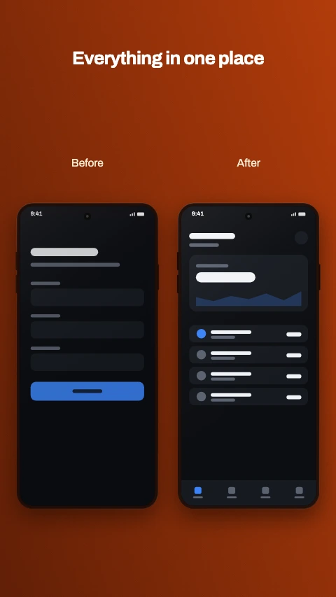
Before and after
Two devices side by side, labelled. The transformation shot.
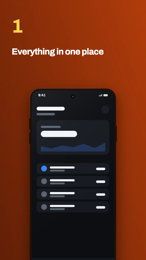
Numbered step
A large numeral, then the caption. Reads as a walkthrough.
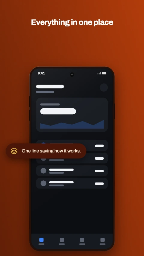
Feature callout
A device with one pill naming the feature it is showing.
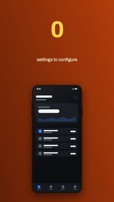
Stat hero
One number carries the frame. An app fact, never a download count.
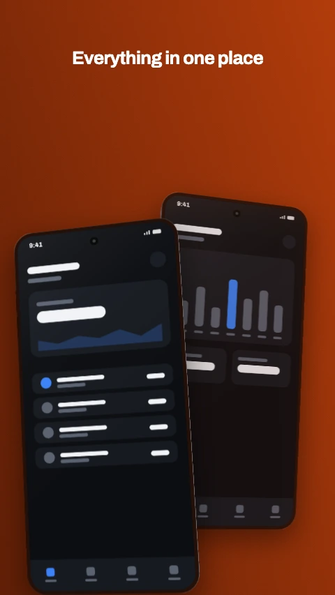
Two phones
An overlapping pair - the way a before-and-after reads best.
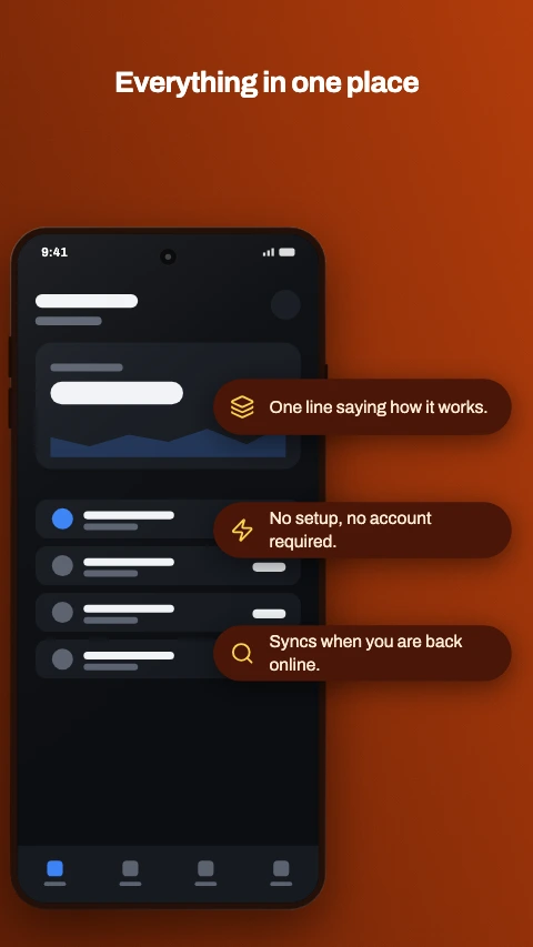
Callout stack
Three labelled chips down the side of the device.
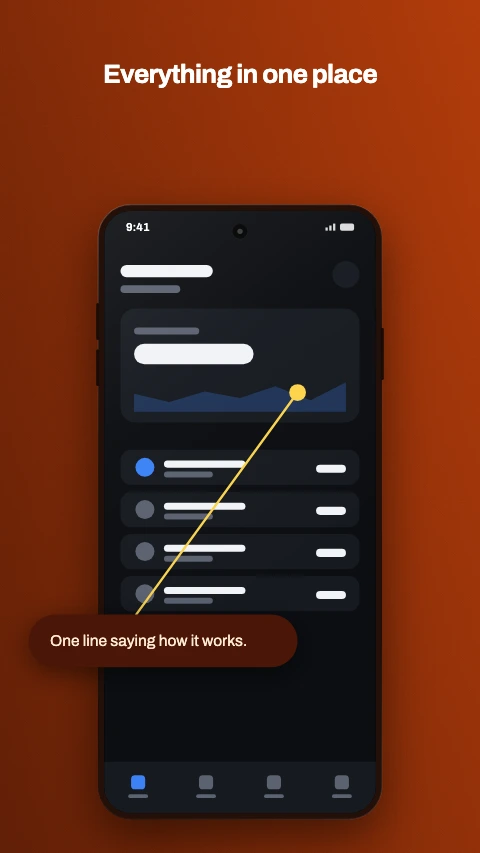
Pointer callout
A label joined to the exact spot on screen it is about.
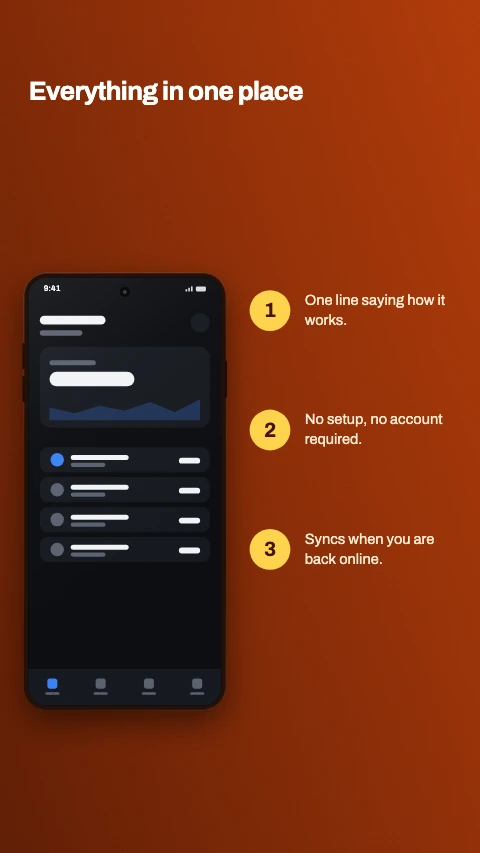
Numbered steps
The device on the left, three numbered steps beside it.
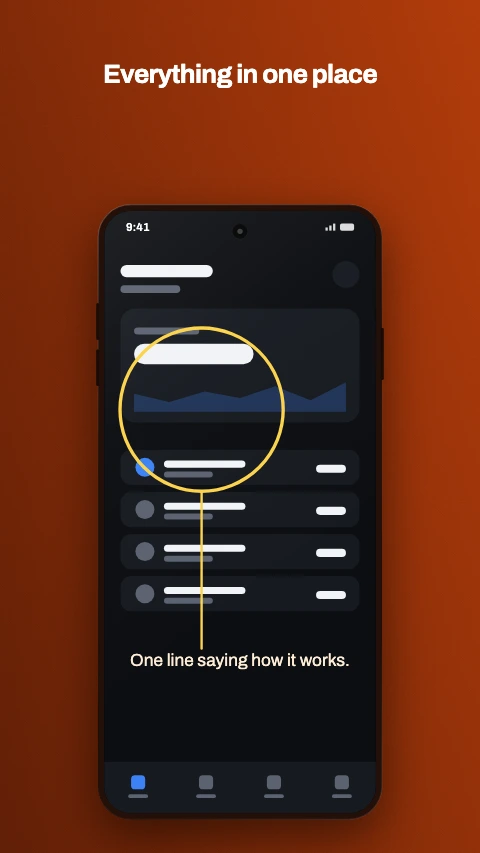
Highlight ring
A ring drawn round the part of the screen that matters.
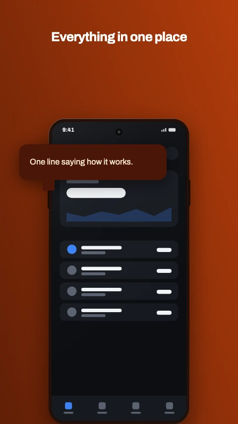
Speech bubble
A bubble with a tail, pointing down at the screen.
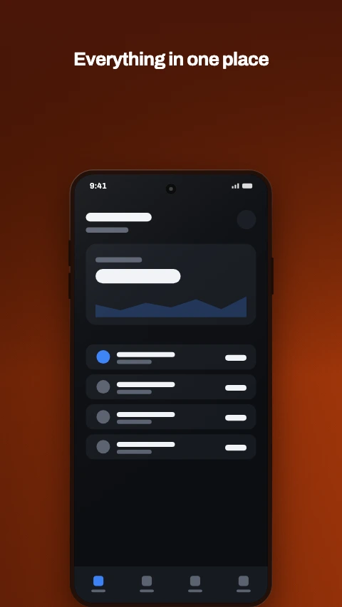
Photo behind
Your image full bleed, dimmed, with the device standing on it.
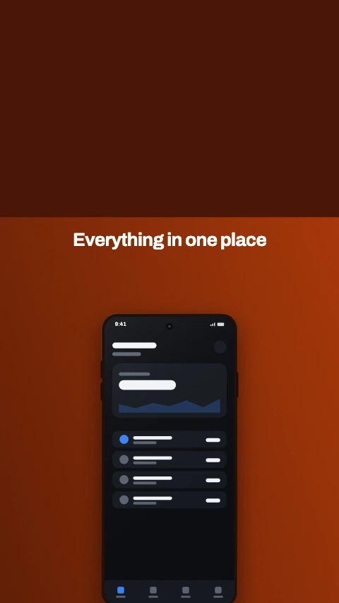
Photo above
Your image across the top, caption and device beneath it.
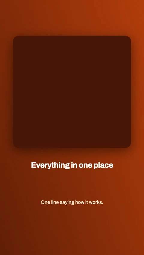
Photo card
One image in a card, with the caption under it. No device.
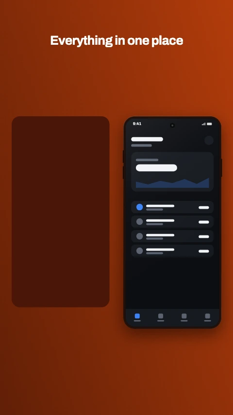
Photo beside
Your image on one side, the device on the other.
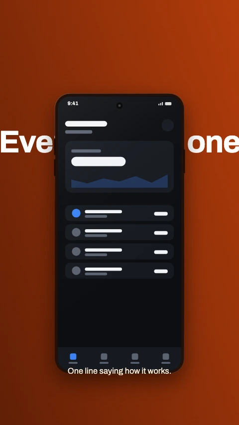
Text behind
The headline runs behind the device and out both sides.
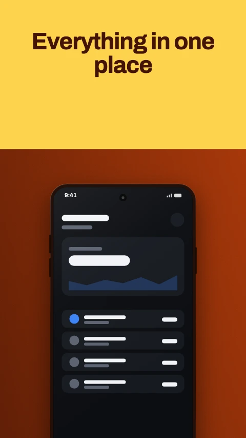
Cut type
A block of colour with the headline knocked out of it.
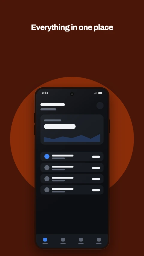
Aperture
A panel with a hole cut in it, and the device coming through.
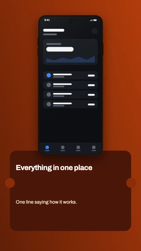
Ticket
A card with notches bitten out of its edges. Device above.
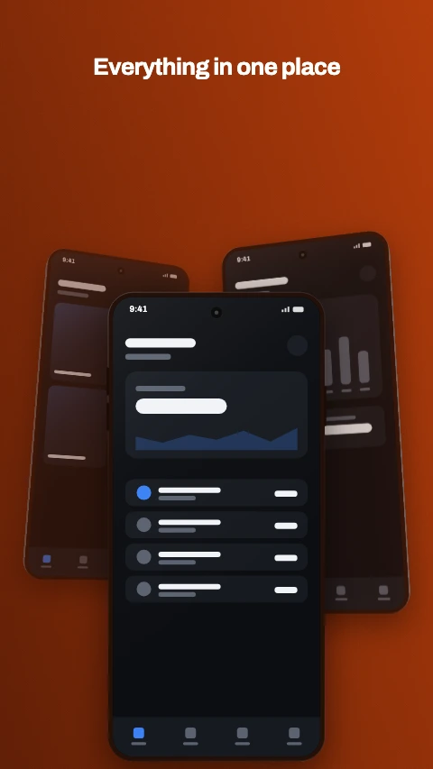
Stacked
Three phones fanned back, the front one in focus.
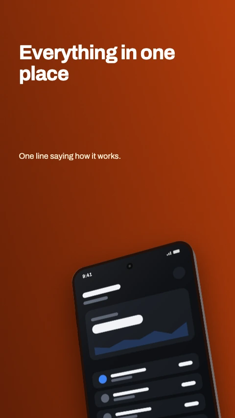
Corner crop
The device leans in from the bottom corner, caption top left.
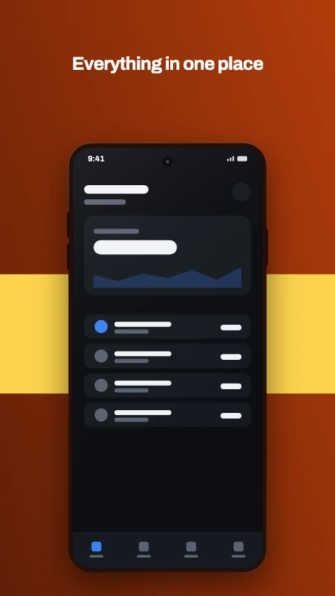
Colour band
A band of accent across the middle, device standing on it.
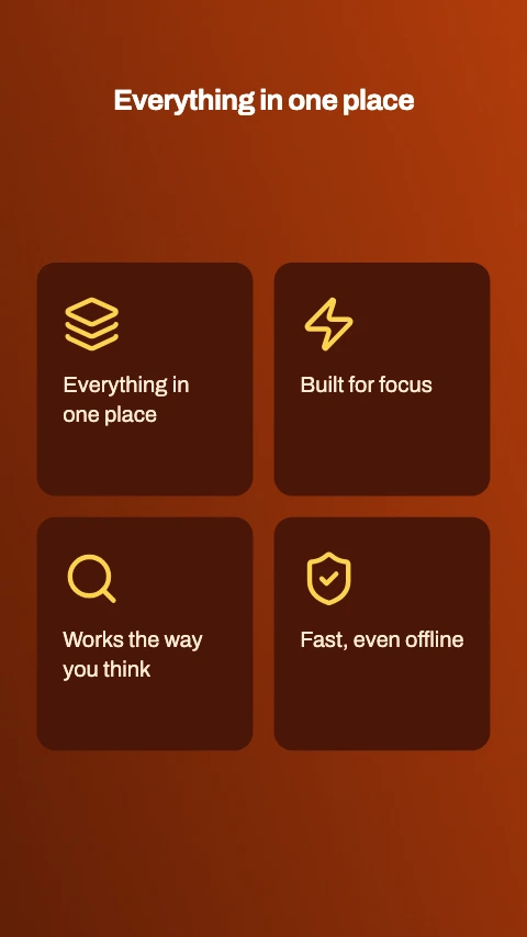
Feature grid
Four features in a two-by-two grid. No device, no capture.
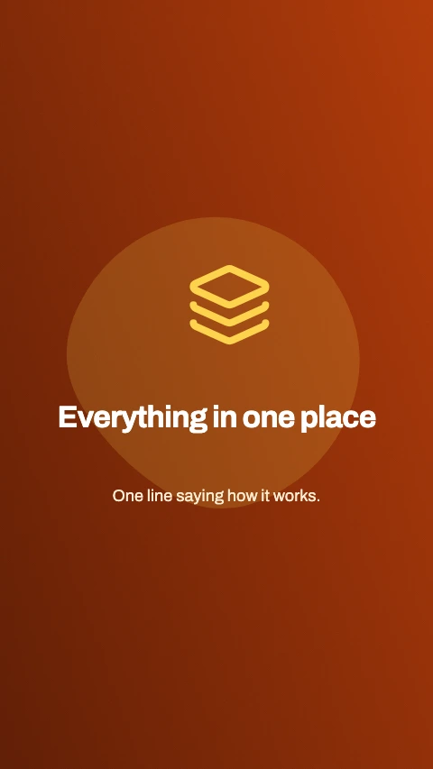
Feature tile
An icon, a heading and a line of detail. No device.
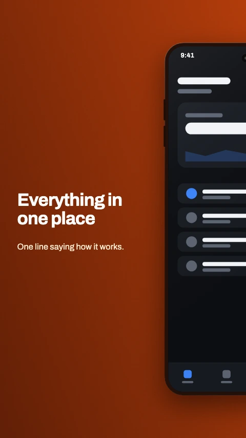
Split phone
One phone straddling the join between two frames. Pairs frames 1 and 2, 3 and 4.
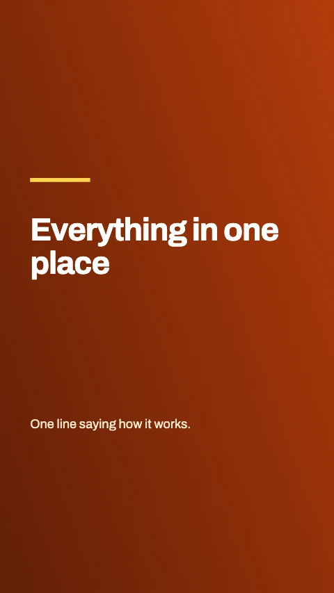
Title and shot
The words on one frame, the phone alone on the next. Pairs 1 and 2, 3 and 4.
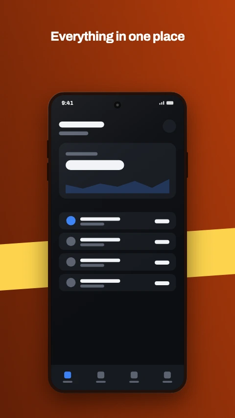
Ribbon
A band of colour that climbs from one frame to the next across the set.
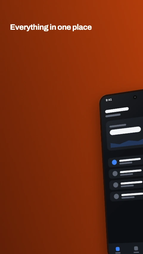
Split phone, angled
The same phone across two frames, turned - the headline on one half, the detail on the other.
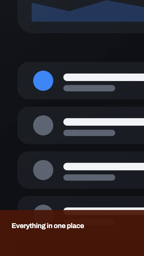
Split screen
One screenshot with the chassis cropped away, cut in half down the middle across two frames.
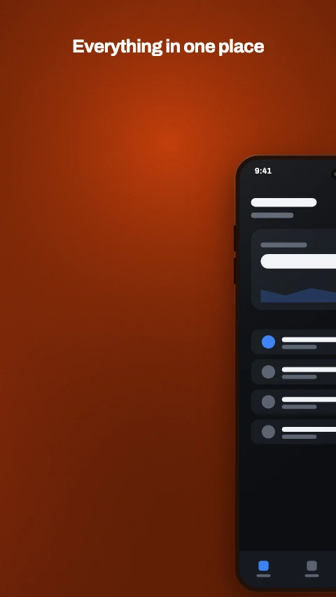
Split run
Two phones running across three frames, on one unbroken background.
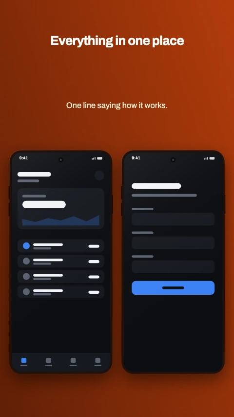
Side by side
Two phones, level and the same size. For a feature that takes two screens.
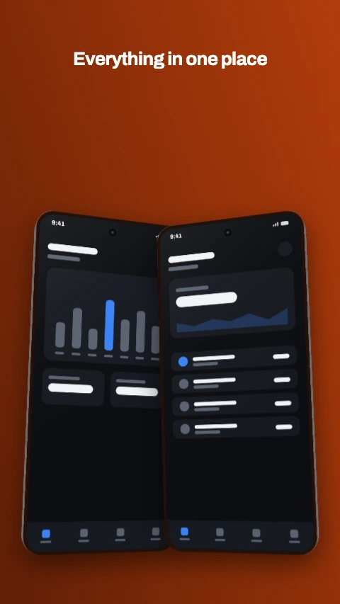
Mirrored pair
Two phones turned toward each other, overlapping at the middle.
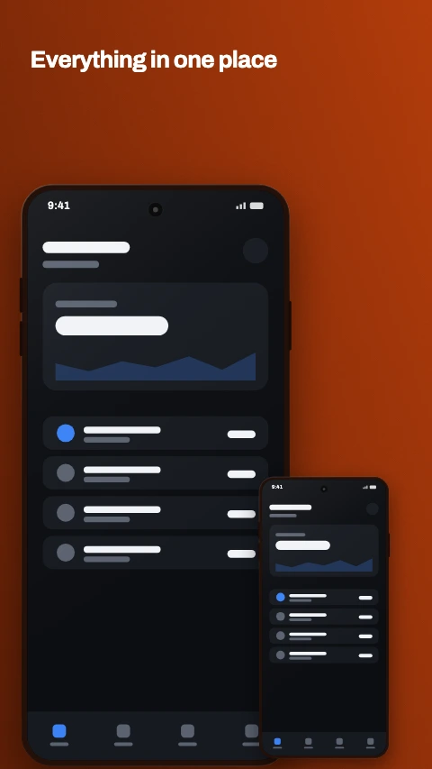
Hero and inset
One phone large, a second small one cutting across its corner.
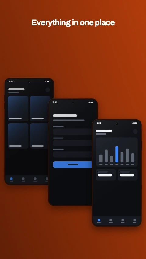
Cascade
Three phones stepping down and across. A flow, left to right.
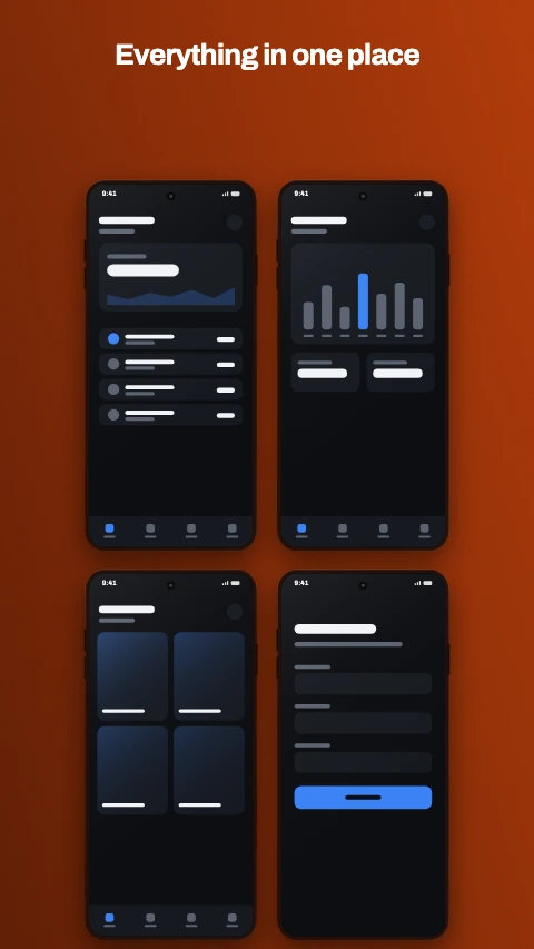
Four up
Two by two. The whole app on one frame, for the opening shot.
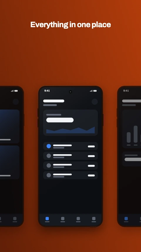
Phone row
Three phones in a line, the outer two running off the edges.
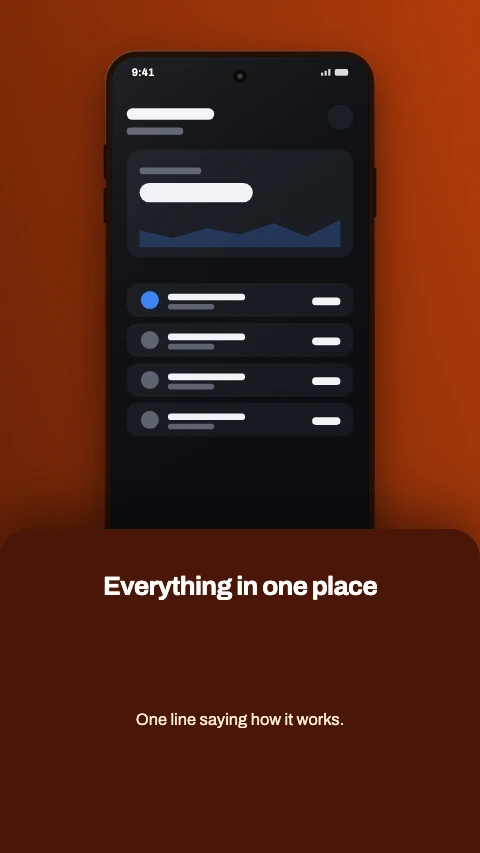
Bottom sheet
The phone above, the words in a sheet that slides over its foot.
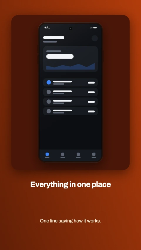
Framed card
The phone inside a card, the caption underneath it.
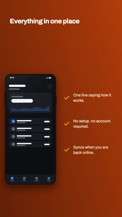
Checklist
The phone on one side, three ticked lines on the other.
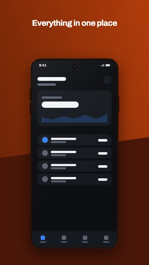
Diagonal split
The ground cut on an angle, the phone standing over the cut.
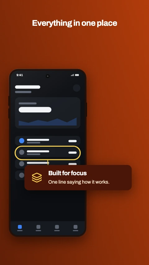
Zoomed row
One row of the screen ringed, and the same row again at three times the size.
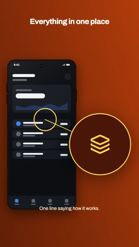
Magnifier
A round lens beside the phone, holding a close crop of the detail it rings.
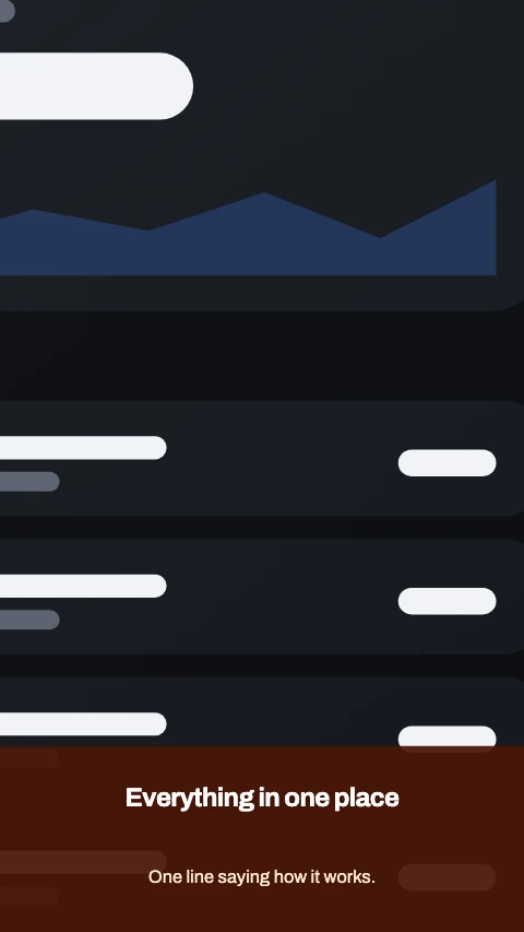
Close up
The screen blown up past every edge, so one corner of the app fills the frame.
19 colour themes
A theme decides the palette, the typeface, the device finish and how the shadow falls. Every one below is on the same layout - Caption above - so what changes is the register rather than the arrangement.
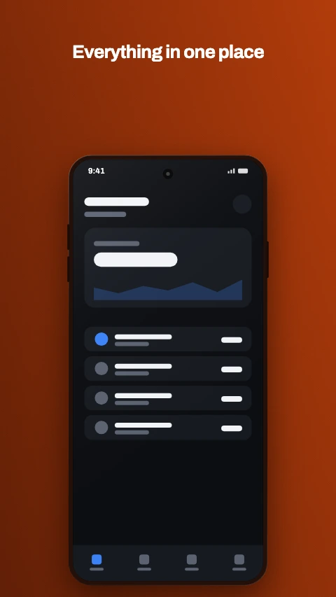
Ember
Burnt orange over a deeper ember. Warm where the dark registers are cool.
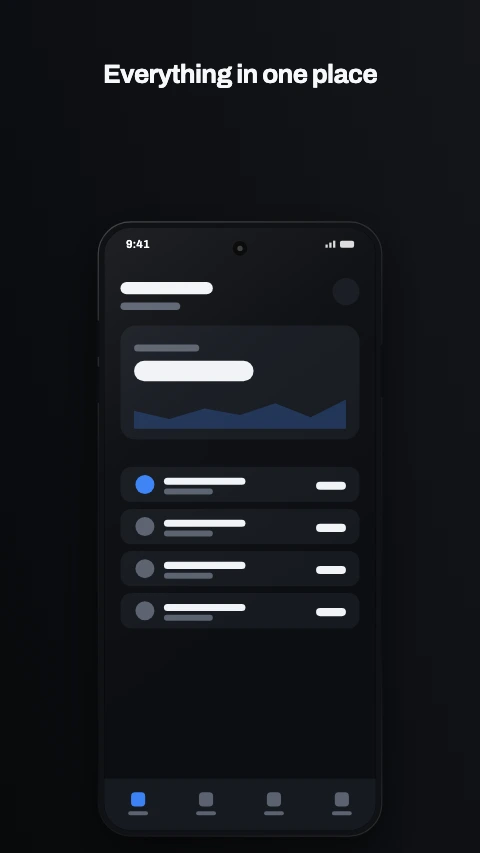
Carbon
Near black with one bright accent. The default premium register.
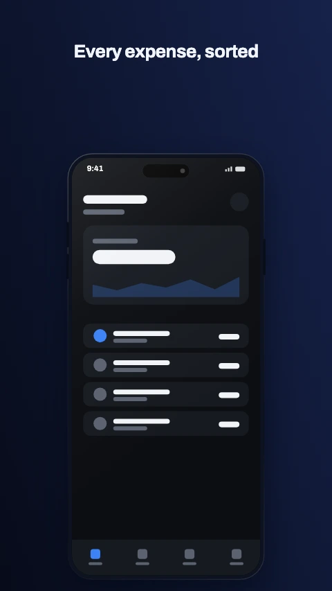
Midnight
Deep navy and a champagne accent. Reads as trust, so: finance.
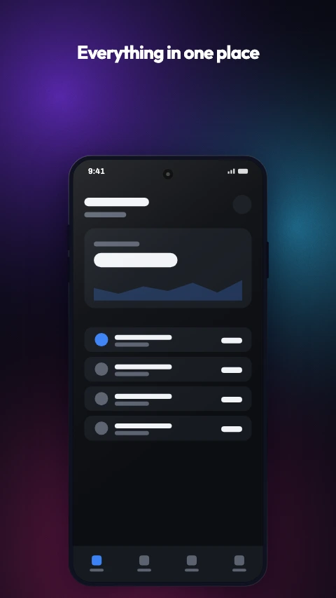
Aurora
A holographic wash over near black. Violet, teal and magenta.
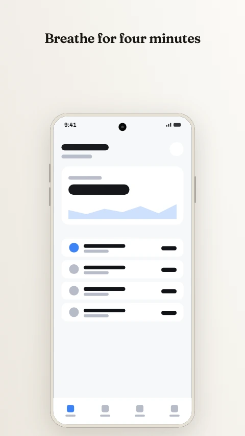
Paper
Warm off-white and a serif. The calm end of the light register.
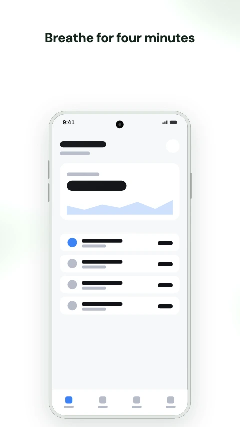
Sage
Muted greens on light. Wellness without the stock photography.
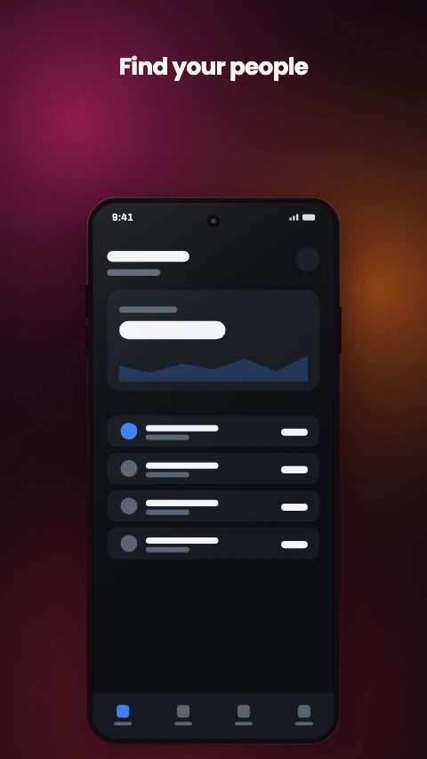
Coral
A warm mesh on near black. The social and lifestyle register.
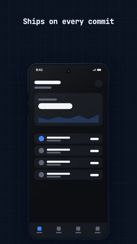
Blueprint
A grid, a mono face and a cyan accent. Built for developer tools.
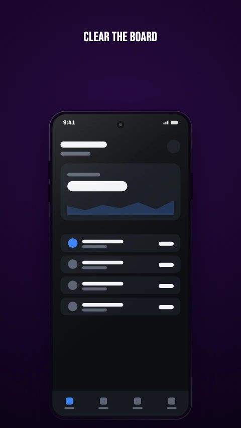
Neon
Near black, saturated accents, outlined display type. For games.
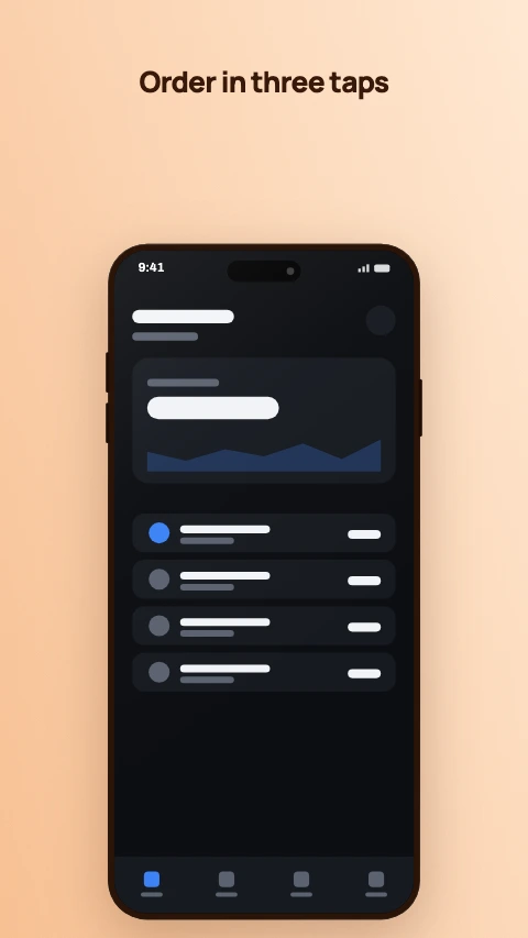
Sunset
Warm light, dark ink. Friendly without being loud.
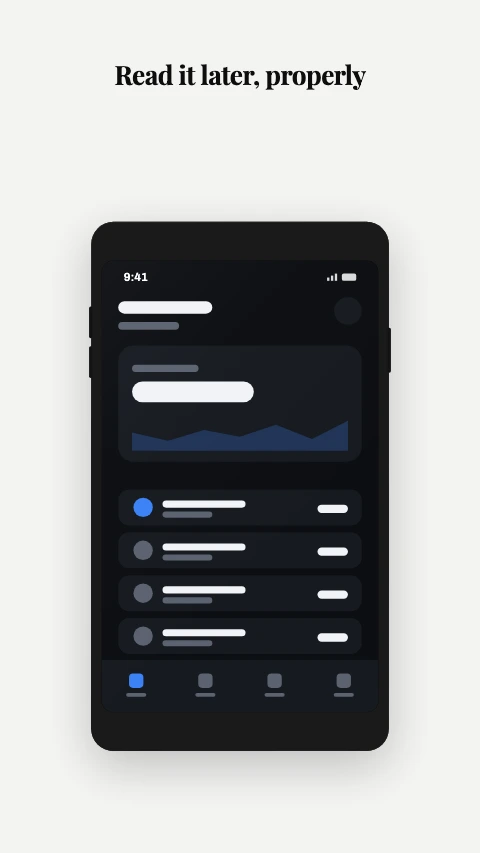
Mono
No colour at all. A serif at maximum contrast, and nothing else.
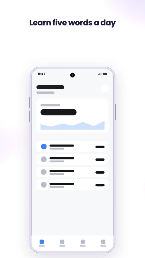
Pastel
Soft light mesh and a violet accent. Playful, for a younger audience.
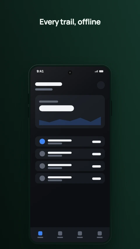
Forest
Deep green and a mint accent. Outdoors, maps, anything unplugged.
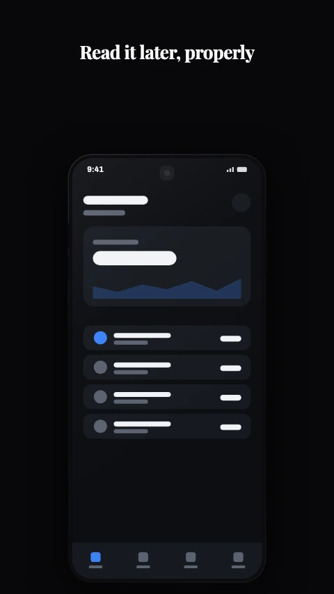
Noir
Black, white, and a hairline. The dark twin of Mono.
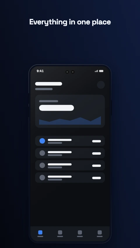
Cobalt
Electric blue on a deep blue-black. Loud without being warm.
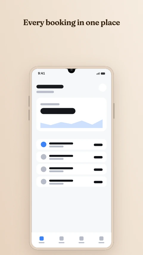
Clay
Terracotta on sand. Earthy and unhurried.
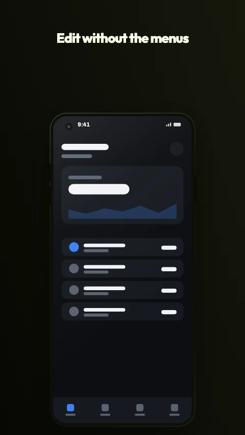
Citrus
Lime on near black. The loudest thing here, and it knows it.
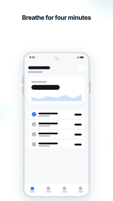
Arctic
Ice blue on near white. Cold, clean and very quiet.
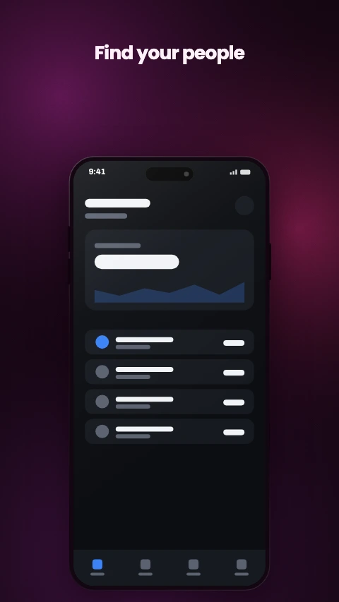
Plum
Wine and rose. Evening rather than midnight.
The two axes are independent, which is the part that matters on frame six of eight: picking a style replaces the frame, and picking a theme only recolours it. Nothing moves, nothing is retyped, and the whole set changes register in one step.
Feature graphics and app icons
A 1024x500 banner and a 512x512 icon are not screenshots, and a layout written for a 9:16 canvas does not become one by being squashed. These are their own designs.
Photo card
One image in a card, with the caption under it. No device.
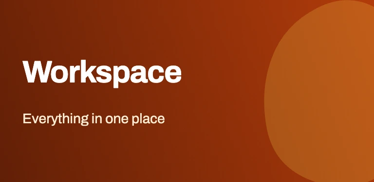
Wordmark and artwork
Name on the left, a wash of colour on the right.
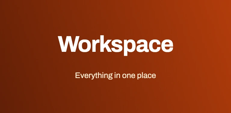
Centred wordmark
Name and strapline, centred, nothing else. Survives any crop.
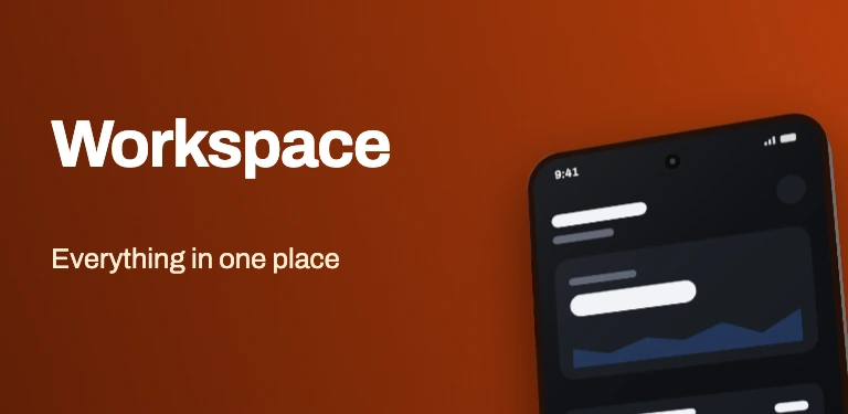
Wordmark and device
Name on the left, a phone cropped off the right edge.

Glyph
One symbol on the theme's ground. The safest icon there is.
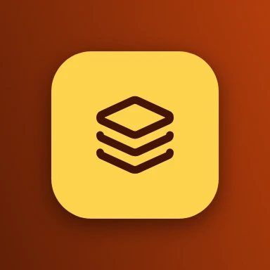
Glyph on a plate
A rounded plate well inside the mask, with the symbol on it.
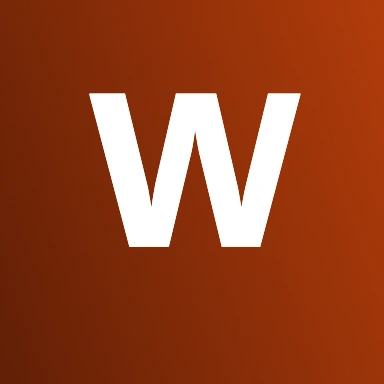
Monogram
A single letter in the theme's display face.
How a template behaves once it is yours
The difference between a template gallery and a design tool with templates in it.
- It is a document, not an image
- Every layer is live. Move the headline, retype it, change the device, swap the palette, drop your capture into the screen or into a photo slot. The template decided where things started, not where they have to stay.
- It resizes rather than restarting
- Layouts are written as proportions of the canvas, never in pixels, so one design lays out correctly as a phone screenshot, a feature graphic, a square social post and a website hero. Copying a project into another slot rescales the artwork into the new canvas.
- It keeps the set together
- A store listing is two to eight screenshots that have to look like one set. The theme is remembered, so adding a frame continues the look instead of dropping a blank one into the middle, and restyling applies to every frame at once as a single undo step.
- It exports the file the Console asks for
- Play wants 24-bit PNG with no alpha channel, and no browser canvas can write one - every tool that exports through the canvas API hands you a 32-bit file. The exporter encodes the PNG itself with the alpha plane dropped, at the size the slot opens at.
Frequently asked questions
Are these app store screenshot templates free?
What is the difference between a layout and a theme?
Can I edit the template after I pick one?
Will a templated screenshot be rejected by Google Play?
What sizes do the templates come in?
Are the previews on this page real?
Pick one and start
The editor opens into a project with the template picker one click away. If you are sizing a Play upload rather than choosing a design, the Play Store screenshot sizes page is the reference for that.
Open the studioThe rest of the toolkit
One editor, and a page for each job people bring to it.
Play Store screenshot sizes
What size does Google Play want, and will my file be rejected?
Phone mockup generator
I need a hero image for a landing page or a launch post.
Device mockup frames
I need a frame that is not a phone, or a phone that is not dated.